Public holiday
The CovidTracker website had started as a visualisation exercise using open public data. One year on, it has become a meeting point for a wide range of audiences: journalists, doctors, politicians, patients, and ordinary citizens. At the centre of attention were various curves, forms of writing so simple because they show us the measured dynamics of the virus and its effects, and so complex because they require legends, calculations, sources and explanations.
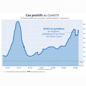
Among these curves, this beautiful blue one, which is said to be “smoothed over 7 days”. It therefore evolves slowly, cushioning the thread of contaminations, tests and their irregular transmission to multiple information systems by calculating an average over a week. And yet, sometimes, we see worrying upward or downward slope breaks. They are immediately commented on by the continuous disinformation channels.
So what to do? Should we leave these data, which are only raw in name because of the complexity of their chain of incrimination, or should we add another piece of graphic information? The website has finally chosen to inscribe these small dotted lines, with a legend, as if they were hand-drawn.
“Correction of public holidays”, it says. Those special days when everything is closed, including laboratories and pharmacies, making it almost impossible to perform PCR tests. In practice, there are so few new positive cases to report that one can read a ruffled rather than a smoothed curve. Once this is duplicated, which is the correct curve? The solid blue one, based on tests that have been carried out, or the dotted red one, inferred from what should have been, if all days of the week had been worked? Public holidays, blessed days when even the virus is on holiday.


