Trial

Paris, march 2011.
Footnotes are part of the diverse elements that progressively took place during the long rise of the printing press and the graphic space reorganization of books. Today notes are fully part of our reading and writing practices: one knows that notes are placed in a particular site, next to the main text, but displayed and extended elsewhere, in order to give complementary information and open wider horizons.
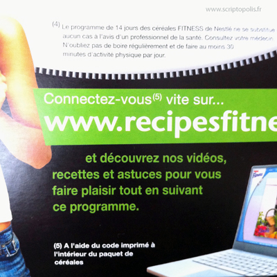
When they take place on packaging, finding notes is not always obvious. They are sometimes placed on the opposite side of the box or hidden in a corner. If designers display several graphic components (photos, drawings, logos, texts and notes) on a surface, sometimes the 3D assemblage radically changes the distribution of text zones.
Fortunately here, the footnote n°5 is near the text. Yet, the complementary information is not all given straightaway. The note points out that a secret code is at one’s disposal on the packaging, but inside. Following the note is then considerably lengthened: it’s only after having taken these steps and collecting small pieces of information that one will discover the wonderful dietetic program extolled on the packaging. However, it is better to eat the entire meal contained in the box before accessing the code and entering it on the appropriate web site. Then, a diet regime will become a priority.


